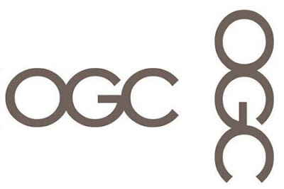
HM Treasury recently unveiled a new logo for the Office of Government Commerce but when deciding on the logo it failed to take a look at it on its side.
The £14,000 logo was intended to signify a bold commitment to the body’s aim of “improving value for money by driving up standards and capability in procurement”, but the employees quickly spotted the clanger.
A spokesman for OGC said: “It is true that it caused a few titters among some staff when viewed on its side, but on consideration we concluded that the effect was generic to the particular combination of the letters OGC - and it is not inappropriate to an organisation that’s looking to have a firm grip on Government spend.”
A spokesman for OGC said: “It is true that it caused a few titters among some staff when viewed on its side, but on consideration we concluded that the effect was generic to the particular combination of the letters OGC - and it is not inappropriate to an organisation that’s looking to have a firm grip on Government spend.”
FIRM GRIP INDEED!
No comments:
Post a Comment